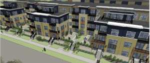
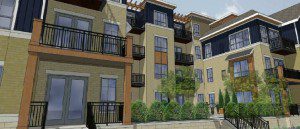
This project elicited one of my favorite quotes ever from a citizen member of a committee. Ever.
Here’s the audio:
This is an informational presentation to the Urban Design Commission on a project at 701 E. Mifflin St. . . . and the greed it represents.
Presentation by Developer
The architect (Joe Lee) was there 2 years ago with a different client, their clients is now Terrance Wall. The proposal is similar to what it was 2 years ago, with a few exceptions. This is different in that it has one single level of parking under the entire site accessed on Livingston and the middle of the Mifflin block. There are water table issues. They are proposing to bring the parking down 5 feet and bring the residential up 5 feet. They have a 3 and 4 story building, they have met with the neighborhood several times. Along Mifflin and Dayton there are courtyards that open up to the streets to break up the massing and bring down the scale of the buildings and they step back the 4th floor. They did have 5 stories in the last version, with this proposal it is 4 stories on Mifflin, Livingston and part of Dayton. The neighborhood really wanted 3 stories on Mifflin, so they pushed the 4th floor back. The architecture has a pitched roof treatment on Dayton because the neighborhood wants that. UDC members laugh, they don’t like it. He says it does compromise some of the 4th floor units, they prefer flat roof, especially on Mifflin, but they are willing to to the pitched. Planning staff sent an email and they were asked to answer questions. The first is the raised parking deck, there are walk outs on the first floor and access to the courtyards from the street as well. The staff wanted to know about the interaction for pedestrians, they can’t lower the parking because it would be a million dollars or more. They have 11 – 12 foot landscape buffer between the sidewalk and building and they will use high end materials and they will do some nice landscape treatment, as well as the steps that go into the unit. They don’t have many other options with the parking because the property is landlocked. They can do an appealing public realm that won’t be overwhelming. The other issue with staff is to have the building separated into distinct portion. They have 3 sides on Mifflin, Dayton and Livingston, they are looking at the color pallet and might change the roof pitches to create a varying aesthetic. They have some photos with different colors and that helps create some interest. They are looking for feedback on that. The staff also was concerned with the pitched roofs, the neighborhood prefers this, they think it integrates more with the homes across the street, staff disagree, they laugh again. He talks about the materials, fiber cement. Its a big project, there is a lot going on and there is a lot they have to resolve yet.
O’Kroly asks where the lot line is, how much of the cement will be gone. He points it out. Dick Wagner says that they will need an easement.
Public Tesimony
Patrick Heck is wearing two hats, he is chair of the development committee for the neighborhood association and the steering committee has issues their report and on February 12th the neighborhood association will come to some conclusion about the level of support. He says that the proposal has been relatively well received and the things that Joe referred to was true, they prefer the pitched roofs, he will not endorse that personally, one of the reasons is that he is also the President of the Das Kronenberg Condo Association and he says that he can speak more opening about what the neighbors think and they are more concerned about the height and the pitch increases the height. The top of the 4th floor of this building will be the middle of the 5th floor at Das Kronenberg which is 6 stories.
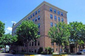
So it is quite large, they show an elevation. That is their concern but the rest of the neighborhood will weigh in shortly.
Discussion
Dick Wagner says that it is safe to say that there is not much support for the pitched roofs. More laughing. They says its not the appropriate scale. Wagner says that this is not the only place they are building with the water table, Park Central, he says he doesn’t find that particularly unfriendly. Ledell Zellers says the 400 block of E. Johnson has it too. Wagner says they need feedback on if that works, but all of it is brand new. Al Martin asks if they want the staff to bring that forward, Wagner says it would be good to have. They are doing it all over, they want to know where it is done well. It doesn’t offput him (not sure who) but he would like to see where it is done well. They don’t want to see a solid brick wall. Lots of talking. They talk about things that can make a difference, frequent walk up, fenestrations, etc. O’Kroly says that a court yard doesn’t do it. That is not comfortable. Wagner says that is a question of solution, they have to talk about it.
Richard Slayton asks how deep the parking stalls are. Joe Lee says there are three ways to do it with the city, 9 x 18, or 50% compact, so they did all smaller with no compact. They have the minimum, 7, 23 back up. 20 – 30 stalls 18 feet deep? Correct. So every 3 stalls, make them 12 feet deep and tell the city private, because this can be done. They laugh again. I know you don’t want to do that, but you better do something because this is not going to pass, you need a whole different way of thinking about making this work. And then you can have setbacks that are 27 weet wide and 5 feet deeper and create landcape zonings, now that is a start. I look at this and I think how many units does a person need, it just seems so dense compared to other areas of town. I look at the narrow corridor, where does a person go when they want to breathe. He is very concerned about the greed that this represents, honestly.
Joe Lee says they had a 5 story solution and in an effort to bring the height down, they maximized the sidewalk, they are smaller units, there are 189 and that is the max that is allowed for the zoning.
Another commissioner says that there is just so much going on here that he can’t convince them that they can’t economically have fewer units and make it work, he has seen it done. He says it is a huge mass and you’re not really breaking it up by having different colors. You’re creating something that makes it all blend in, he says you have too many patches and you almost need stronger colors.
Wagner things the monochrome colors make it disappear. Other guy (John Harrington) disagrees. Wagner thinks an active color pallet will make it seem busy. Other guy says he isn’t saying that, just not so much patchwork. He doesn’t see individual buildings. Everyone agrees. They compare it to Johnson Row. O’Kroly says that is half the size, Wagner doubts it.

O’Kroly says that the block depth is different. Wagner agrees, but says the running street facade is the same. Not sure about Park Central.
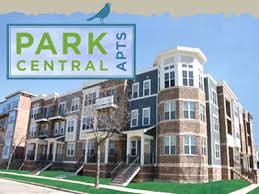

(Sorry, bad photo) They talk about how the others are broken into 3 masses. They say that they could have different masses have different colors. Wagner says that is just masking what it is, talk about truth in architecture. o’Kroley says that at least it is breaking up what you see. The massing is the issue. Constellation is across the street, you wan’t see the straight on facade from anywhere says Wegner.
Slayton asks if they could have groupings of 5 story towers and then lower massing in other areas? Some open spaces. Lee says that is a tough sell. Martin says that there have been lots of versions. Lee says they vetted it pretty well. o’Kroley asks what the set back is at the Constellation on Livingston. Lee says he thinks 15 feet as well. Another guy agrees with John. He says it is like a woven composition, there were other projects that were more striking, but maybe the masonry goes up in every one, maybe a mix of brick and siding. Some of the older buildings did a lot with just one or two materials. O’Kroley says that they can treat their mass along Livingston, so when you are walking along it you won’t feel like one constant dialogue. They ask about the courtyard and how far apart the balonies are.
That’s it. No conclusion, it was just informational. But generally speaking, I’d say that didn’t go well and they have some work to do. I hope the neighborhood agrees! I might just add tho that City Row is three buildings and Park Central is 2. This one, is one huge massive building, they are not at all the same.

